Into the light

WORDS Persephone Nicholas ARCHITECT Ben Callery
When award-winning architect Ben Callery was asked to transform a heritage-listed Victorian house in Melbourne, Australia, he knew he had his work cut out. Looking back on the eight-month build he says:
‘When we first spoke to James and Jo it felt as though they were affected by living in a cold, dark south-facing house – they were yearning for more light and more warmth. They wanted an addition that would transform their existing living environment and, in the process, lift their spirits too.’ Ben Callery Architects accepted the challenge, knowing the job would not be straightforward.
‘The existing Northcote home was heritage listed, which meant that at a minimum, the front two rooms had to be retained. We were also working with a narrow block that was just 6.5 metres wide with neighbouring walls on both side boundaries that overshadowed the site and reduced ventilation.’
The solution incorporated passive solar design principles, which capitalise on natural ventilation and thermal efficiency to create buildings that are naturally comfortable. The result is a family home that is as beautiful as it is functional.
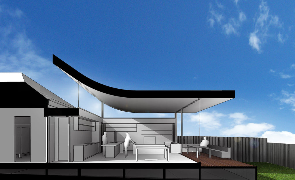
‘We popped up the roof and then curved it up towards the north. The large highlight window brings in warming winter sun and the perimeter of clerestory windows draws in light throughout the day,’ says Ben. The curved light coloured ceiling defines the interior as well as the exterior of the home and is a smart solution.
‘The curved roof lets sunlight into the back of the house and also helps create an illusion of space. The house we built is very functional, but it’s also a beautiful aesthetic space.’
Other clever ideas include a bespoke kitchen from Moda Kitchens that, with its black and timber cabinetry, white Caesarstone bench tops and fish scale mosaic tile splashback, complements the main living space. There’s a well-appointed study nook too.
‘James often works from home so we created a study nook in the living room. It’s a clever space that almost disappears when it’s not in use. For example, we incorporated power points in drawers so he could put his laptop away and charge it while it was out of sight.’ This attention to small things makes a huge difference say James and Jo.
‘Ben added in a tonne of little details that make living in our place such a pleasure now.’ The house is high impact, but was not a big budget project according to Ben. He says spending was prioritised in keeping with the family’s needs.
‘The curved ceiling cost more than a flat ceiling would have and the steel clerestory windows were really expensive, but they accentuate the curve of the ceiling perfectly.
Luckily we could save money in other areas - the front three rooms didn’t need a huge amount of work so we just fitted new floors and insulation there.’ He says they were mindful of budget throughout the project. ‘There are no super high end finishes; the cabinetry is mostly 2-pac, the walls are made of plasterboard and we used local Victorian hardwood for the floors. We were pretty restrained with most finishes and put money into a couple of key things that lift the house.’
With the renovation behind them, James and Jo feel at home: ‘Ours was a difficult project – a south facing, dark, single fronted terrace with a heritage overlay. The solution – to curve the roof upwards to allow in northern light – was both beautiful and practical. The design delivered all the things we wanted in our renovation – more light, more space, more openness. But also a stunningly beautiful space to admire every day as well.’
![]() This article was featured in Issue 28 of Renovate Magazine
This article was featured in Issue 28 of Renovate Magazine

